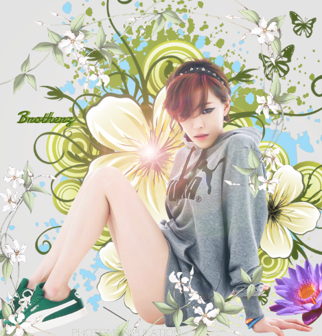
I like the first one, but some small CnC is that It's way too bright and the human render looks a bit out of place since there's no shadow, i know soft shadows would ruin the image a little bit but you could fit in one small shadow to make it pop up a little bit so it perhaps looks a bit more "connected" with the other imagery.
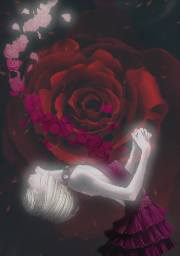
I feel like the second one is just an image that's not been edited and then there's two stock footage grabbed from a free Insanity GFX pack just put on there with a lowered fill.... Feels like you had alot more you could explore but nontheless i liked the fact that you tried to mix it up a little bit but for me it just looks 10% done.
That's just my two cents, otherwise great job on your work, I'm looking forward to see more human-render works since they're a bit tricky but very cool to do if you can execute it perfectly :)


 This topic is locked